Clover Bakery & Cafe
Role: Lead Product Designer (Academic Project)
WHAT IS IT?
Clover Bakery & Cafe is a Japanese bakery located in San Jose, California.
They’re highly rated on Yelp and have been elected one of the top 5 bakeries in San Jose.
THE ASSIGNMENT
This project was an assignment for a Visual Design for the Web class taken at University of California - Santa Cruz.
The objective is to choose a website which could improve with better visuals and branding.
Instead redesigning big companies websites — or business found overseas — I decided to enrich our local business community and redesign and rebrand a Japanese bakery located in San Jose - CA.
CURRENT SITE MAP
First problems found in the current site map are:
The lack of a menu page,
Organization of the tabs are not intuitive to the user,
Contact tab doesn't work in multiples pages.

CURRENT WEBSITE DESIGN
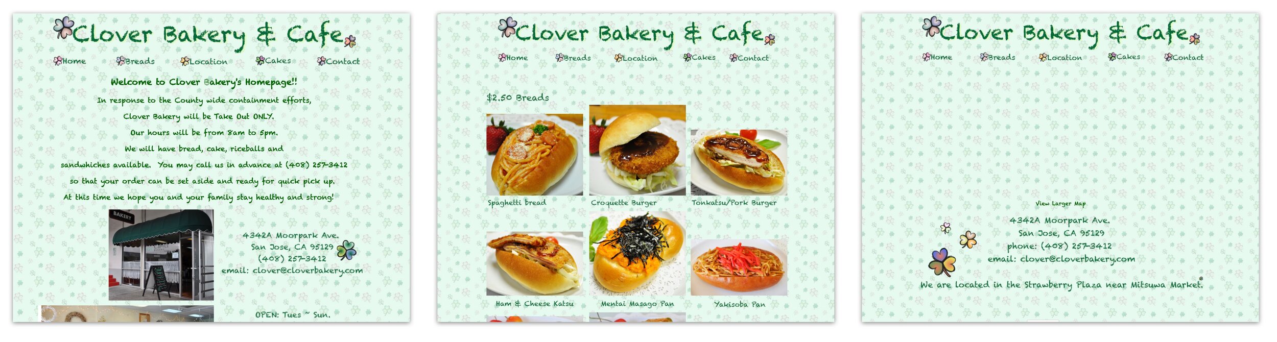
Their current website doesn't have a strong visual image as a brand. It also lacks some functionally — like in the menu page, where some buttons wouldn't work properly. As a bakery, green isn't the best color to refer something warm, tasty and sweet.
Let's give this fantastic bakery, with so many delicious sweets a website it deserves.
CURRENT LOGO

BRAINSTORMING
IDEAS FOR THE NEW LOGO

The use of tracing paper is fantastic to iterate and also to get feedback from a team at work — or from classmates.
FIRST SKETCHES
The idea in my mind was to create something that would look tasty, but also, refer to the Japanese culture.
In Japanese the word “Kawaii” is highly used, and in English we can translate it as “Cute”.
My main goal in this Project then, wasn't only give to this bakery a better looking and tasty website. But also colors and visuals that could be seen as cute as Japanese people love this symbol.

PROPOSED NEW DESIGN
NEW LOGO
The idea of the new logo is to use their name, Clover, but add a sweet spot on the top, a cupcake, who doesn't love it, right?
Going to this direction, the main goal is to give them an entire new brand, a visual that can look tasty but also adding cuteness to it.
DESIGN GUIDELINES
TYPEFACES

COLOR PALETTE

NEW SITEMAP

The “Home" option is now centered, on the left, the user can find the menu and specials offers or seasonal options. On the right side more about the Clover Bakery & Cafe history, and how to find them.
HIGH FIDELITY WIREFRAMES


Home page

Menu page

About Us page

Specials page
CONCLUSION
I think a new design would greatly benefit Clover Bakery & Cafe. As a local bakery, creating a stronger brand and image could potentially bring new clients, leading to more revenue.
I hope some day Clover Bakery & Cafe will improve their website, and have a brand they deserve, because quality, they already have.
Any ideas or feedback? Contact me at nickwbochud@gmail.com
I'd love to chat and discuss about design thinking process and how to improve the user experience!

